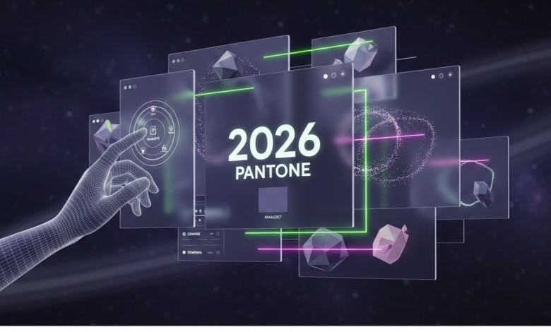
Pantone 2026 is set to redefine digital depth. As we move away from the “Peach Fuzz” softness of previous years, 2026 is leaning into immersive, moody, and ultra-modern palettes—specifically predicted to be Future Dusk (19-3936). It’s a color designed for the era of spatial computing, AI interfaces, and tactile web experiences.
Why Future Dusk for 2026?
Before we look at hex codes, let’s talk about the vibe: Stability meets Mystery. Future Dusk is a dark, moody violet-blue that feels like a bridge between the physical world and the metaverse. For web designers, this means moving away from clinical white backgrounds toward high-contrast, “deep-space” aesthetics.
This color works perfectly with mix-blend-mode and glassmorphism. Because it has such a deep saturation, it makes neon accents and white typography “pop” without causing the eye strain associated with pure black (#000000).
Implementing the Palette
Defining the CSS Variables
This is the first step for any 2026-ready project. Use these variables to ensure consistency across your UI components.
 :root {
     --pantone-2026: #444267; /* Future Dusk / --accent-glow: #b3ff00; / Cyber Lime contrast */
     --surface-glass: rgba(68, 66, 103, 0.4);
}
With the setup above, you can create immersive backgrounds that feel premium. But don’t just use it as a flat color—apply it as a subtle linear gradient to give your landing pages a sense of three-dimensional depth.
Accessibility: The Contrast Challenge
Deep hues like Future Dusk require a Smarter Typography Strategy. Standard grey text will disappear. You need to use high-clarity sans-serifs with increased tracking (letter-spacing) to maintain readability.
.hero-text {
     color: #FFFFFF;
     text-shadow: 0 0 20px rgba(179, 255, 0, 0.3);
     letter-spacing: 0.05rem;
}
By adding a soft glow to your text, you simulate the “Spatial UI” look that is trending for 2026. It mimics the light emission of AR headsets, making your website feel like it’s floating in front of the user.
The 2026 Pairing Guide
Pantone 2026 doesn’t live in a vacuum. To avoid making your site look like a 2010 “dark mode” template, pair it with these secondary accents:
- Cyber Lime: For CTA buttons that need immediate attention.
- Liquid Silver: Use this for borders and dividers to create a “tech” feel.
- Ethereal Pink: A soft gradient transition for hover states.
Conclusion
The Pantone Color of the Year 2026 represents a shift toward more conscious, immersive digital spaces. It’s no longer just about picking a “pretty” color; it’s about choosing a foundation that supports 3D elements, motion design, and high-performance user interfaces.
In short, Future Dusk proves that dark aesthetics are maturing. We are moving past simple “Dark Mode” into “Atmospheric Design.” By embracing these deep violets and twilight blues, you can create web experiences that feel both futuristic and grounded.
Start experimenting with these palettes in your Figma prototypes today. 2026 will be here sooner than you think, and the designers who master these “spatial” colors early will be the ones leading the next wave of web evolution.